Shai Greenberg
We're back again for this blog series on using Kibana to visualize data on COVID-19. In the previous post, we've loaded the data and used Kibana's Discovery app to explore it. This time we'll create some visualizations and add them to a dashboard.

If you haven't yet, make sure you follow the instructions in the previous post in this series about installing Elasticsearch and Kibana and loading the data before proceeding.
Now that we have the data and have a handle on its structure and the possible values, what we want to do is visualize it. You're probably familiar with doing this based on Excel spreadsheets, where you would usually first have to pivot the data, and adding data sources would be a procedure that doesn't really scale. You've already seen how Kibana handles a unified access to ingested sources by using an Index Pattern (and we'll add some more automation to that by the end of this series), but Kibana gives you the ability to visualize data without having to first generate a pivot, or use complex formulas. Let's start with a simple bar chart.
The world behind bars
Click on the Visualize icon in the menu at the left side of the screen (did you know that you can click on the icon in the bottom to expand the menu and see the titles for the Kibana apps?). Click on “Create new visualization"/”Create visualization” (whichever appears depending on your usage history) and choose the Vertical Bar visualization. Choose the corona* Index Pattern you've created.
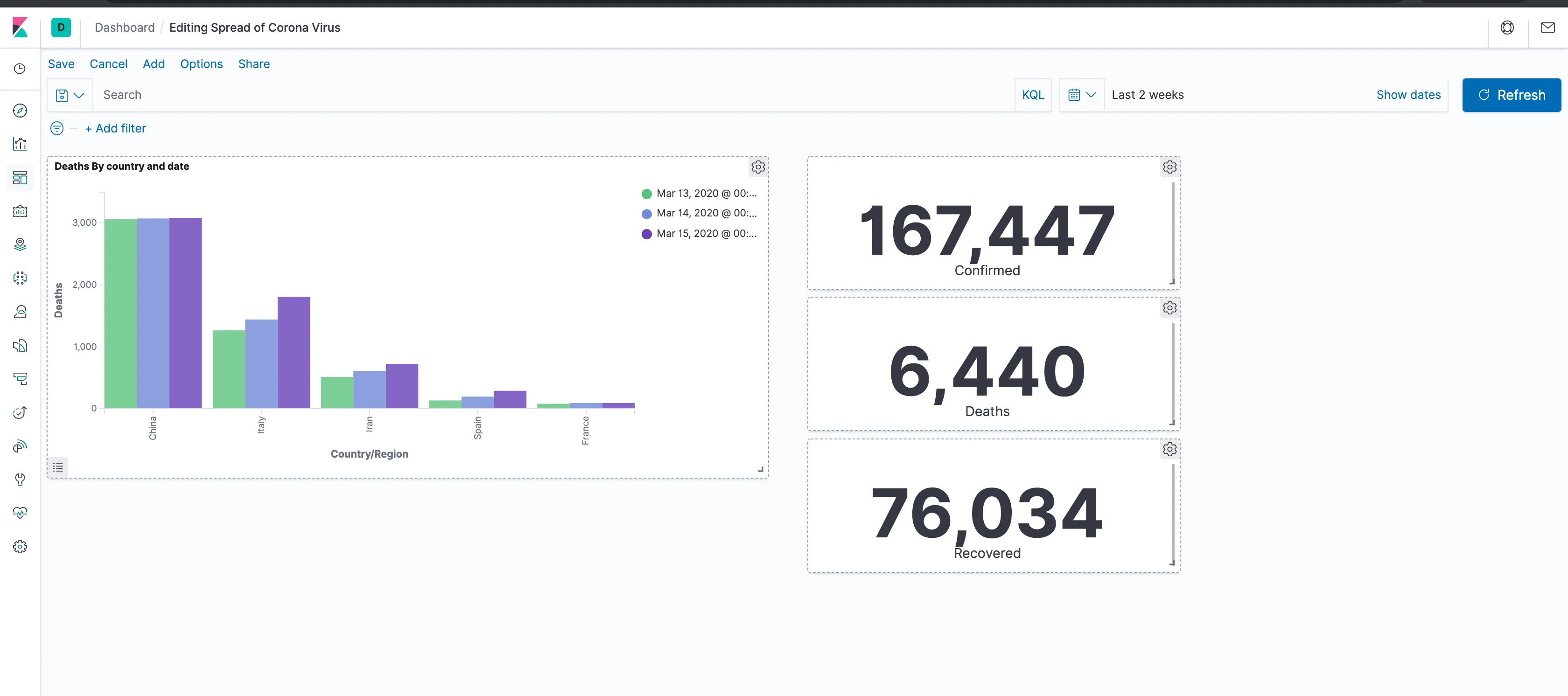
Now, we want to see deaths by country and date (hopefully, one day, less deaths by country and date). So let's first set the Y axis to show a total of deaths. Click the Y Axis and change the aggregation to Sum. Then choose Deaths in the field, and click the "Apply Changes" icon that looks like a play button. If you haven't been using Kibana for a while, it might be the case that nothing shows up, but that is probably due to a time filter that is too restrictive. Open the time filter at the top right of the screen and choose to show the the period that contains the data you've loaded, then click refresh.
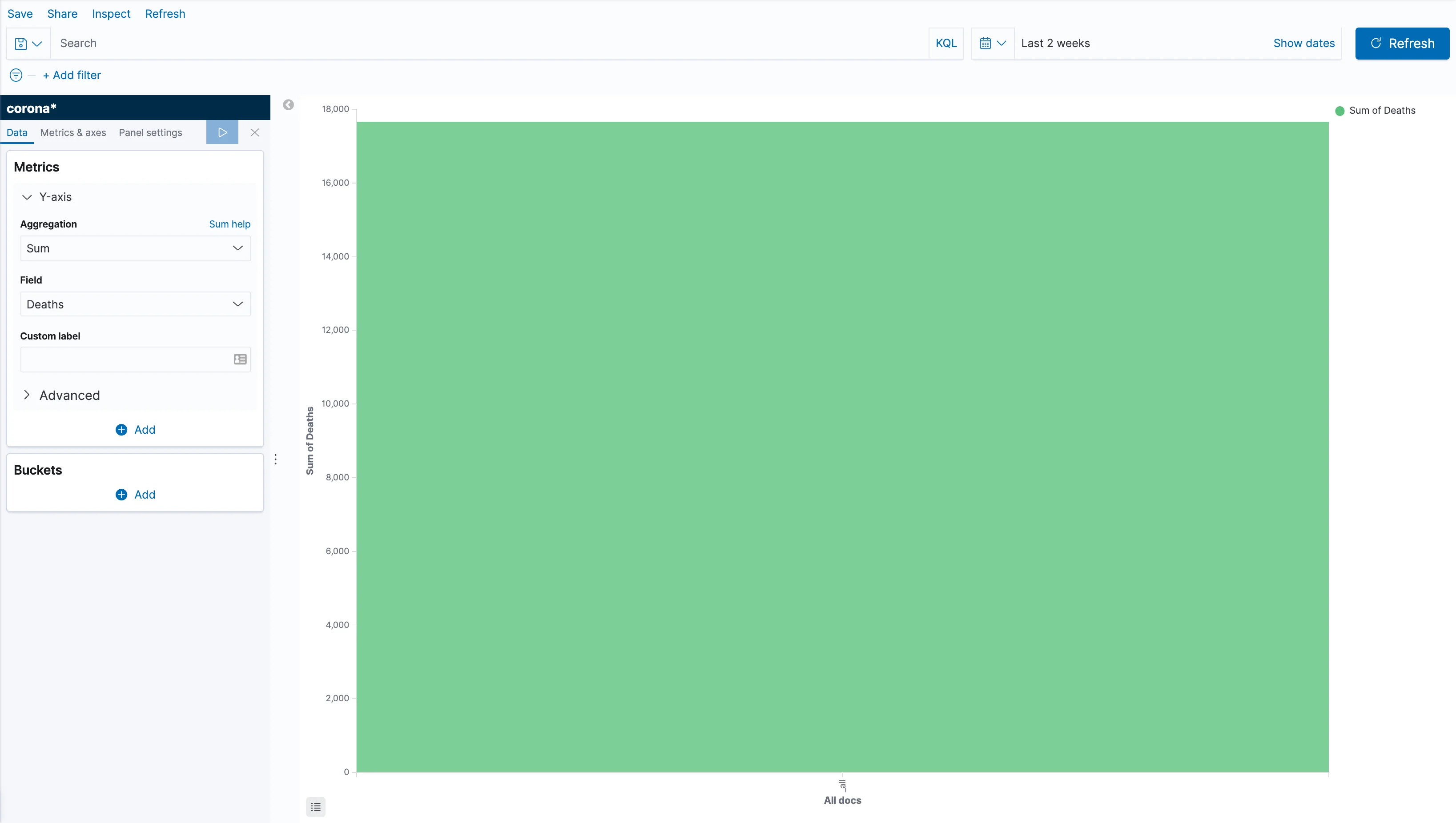
Now we can see the sum of deaths for that period in a single bar, but that's not much help. So, let's split it by country.
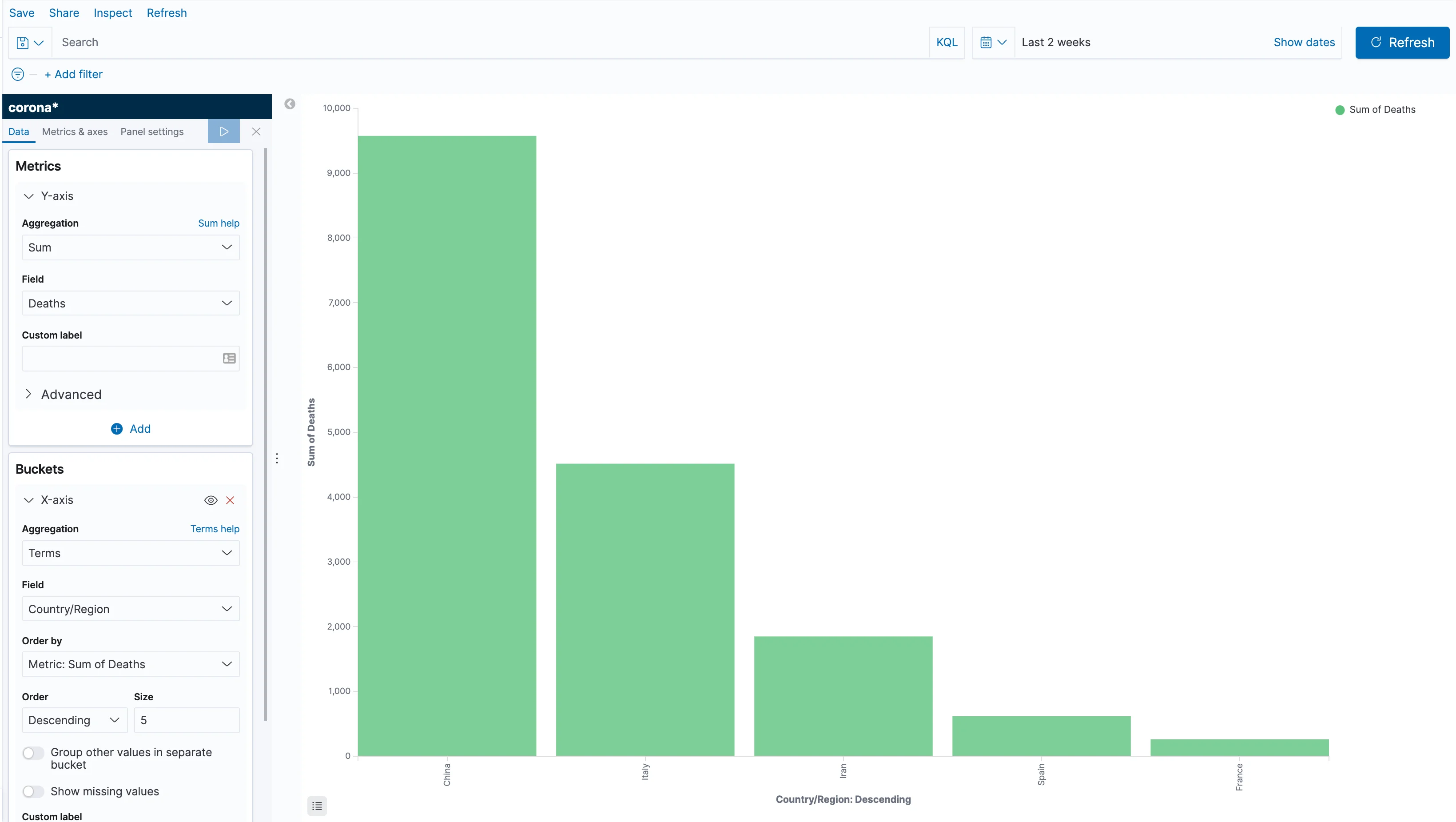
Click Add in the buckets section, and choose X-axis; then, select "Terms" as aggregation, and "Country/Region" as the field. Behind the scenes, what we're telling Elasticsearch is to split the data by country and then calculate the sum of deaths for each country. Apply the changes and you can now see a bar for each country. However, since we've explored the data a bit, we know that each bar contains the sum for all of the days we've loaded. Let's fix that, shall we?
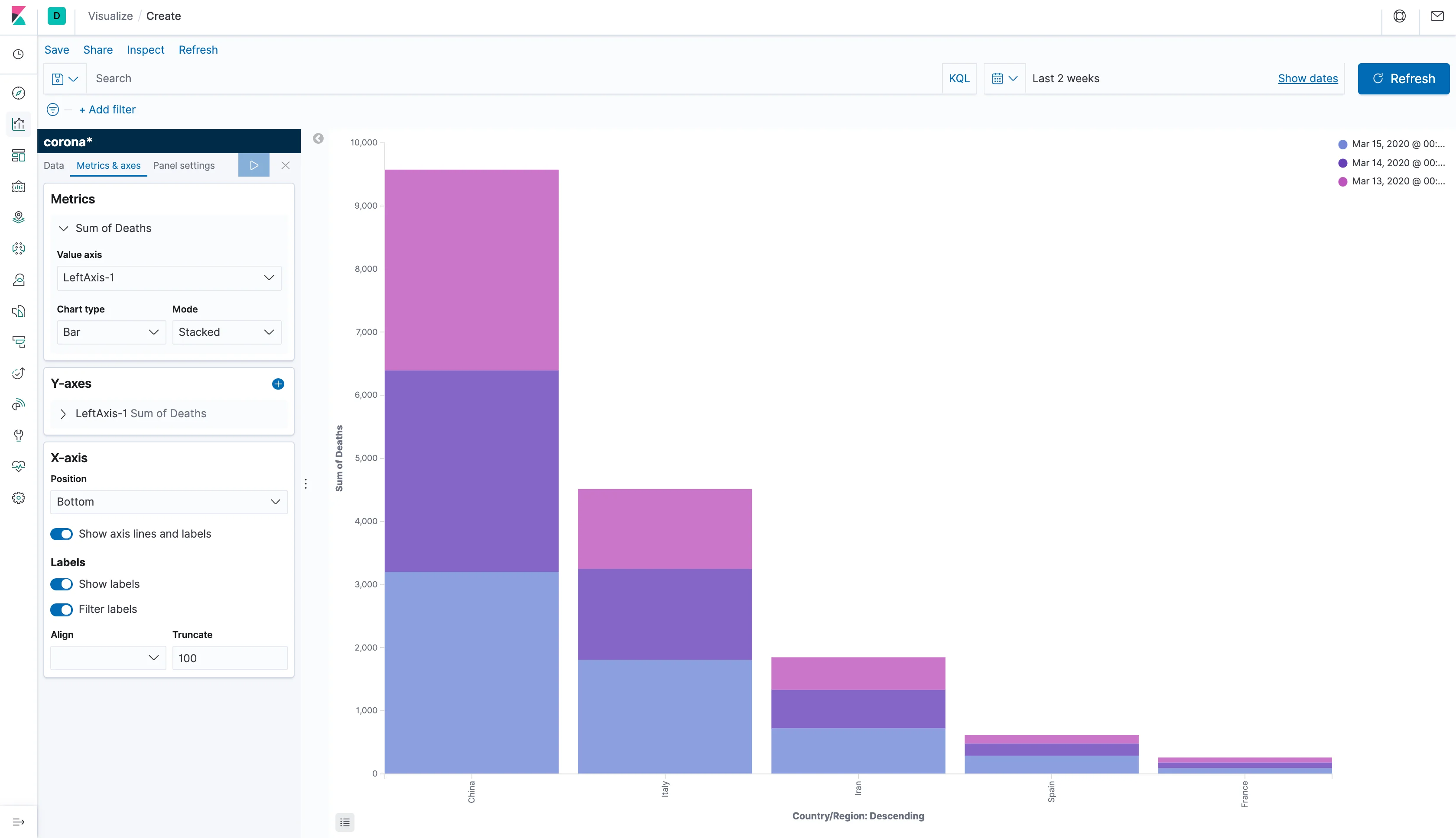
Click Add in the Buckets section again and choose to show a split series, again using a Terms aggregation, this time using the field @timestamp, and apply the changes. The bars will be split by color according to the date.
That's not exactly an easy way to see it and we want to see the differences for each country side-by-side. So, go to the "Metrics and axes" tab and, under the Metrics section, switch the Mode to Normal and, you guessed it, apply the changes.
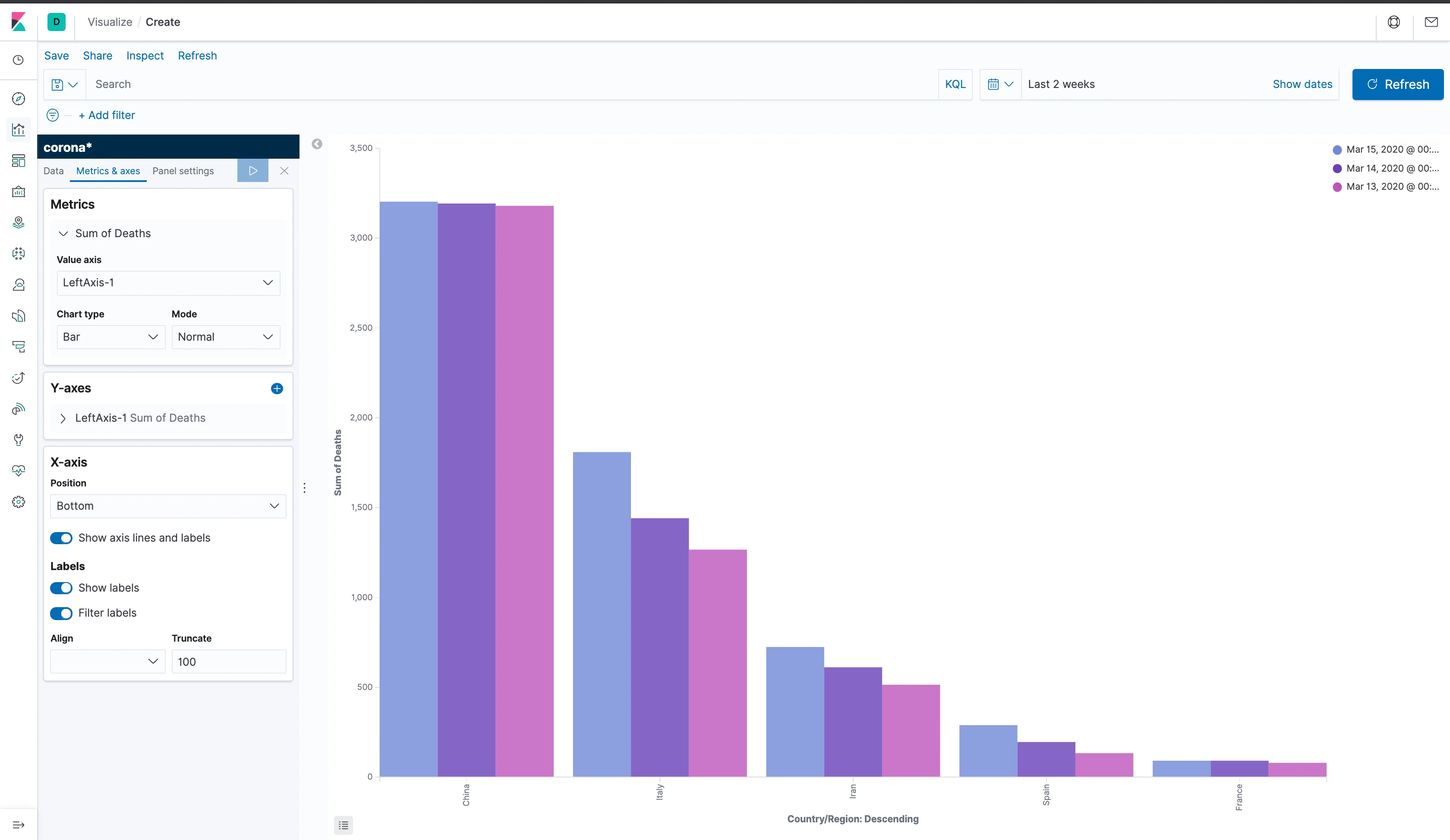
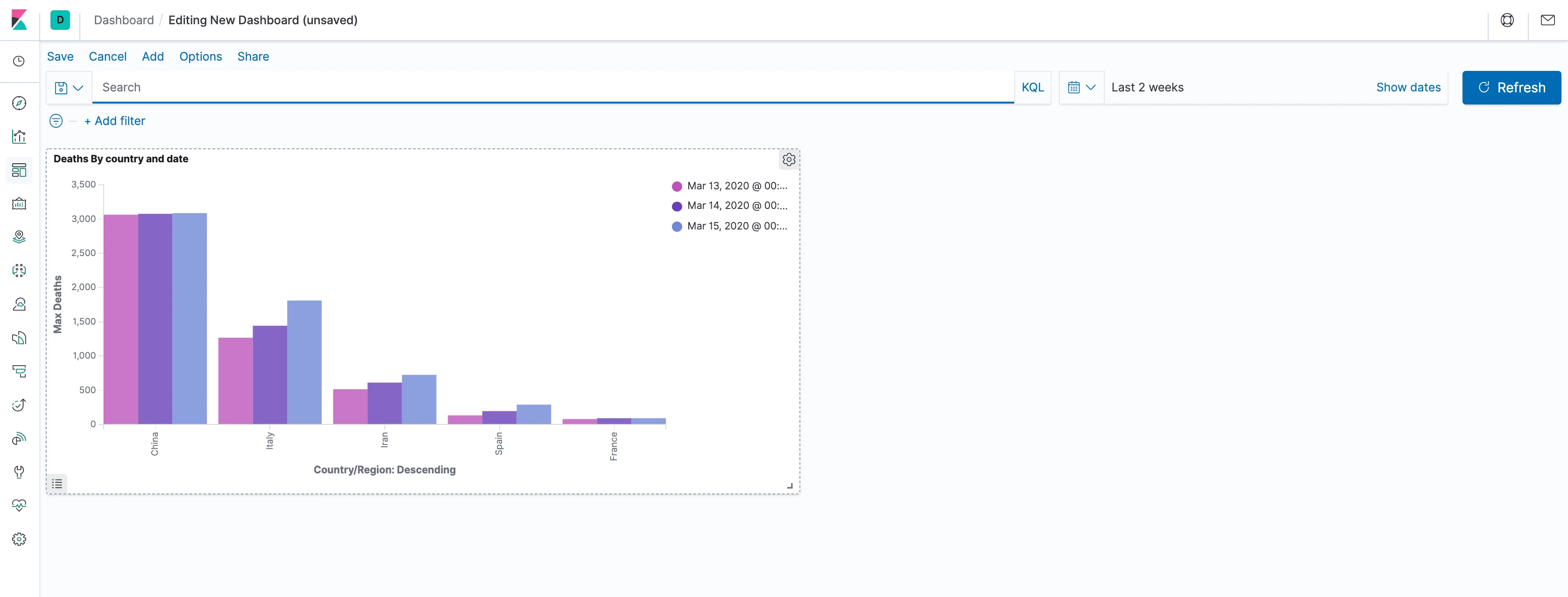
Now, that's more like it! We can now clearly see the differences between the data from different days for different countries. What's still unconventional, is the order of the columns: they're currently being sorted by a descending sum of deaths. While that's an optimistic way to spin the data, what we really want is to sort it by date, in an ascending order. To do that, go back to the data tab on the left and order the split series by a custom metric, which will be a maximum of the timestamp field, and choose to sort it in an ascending order.
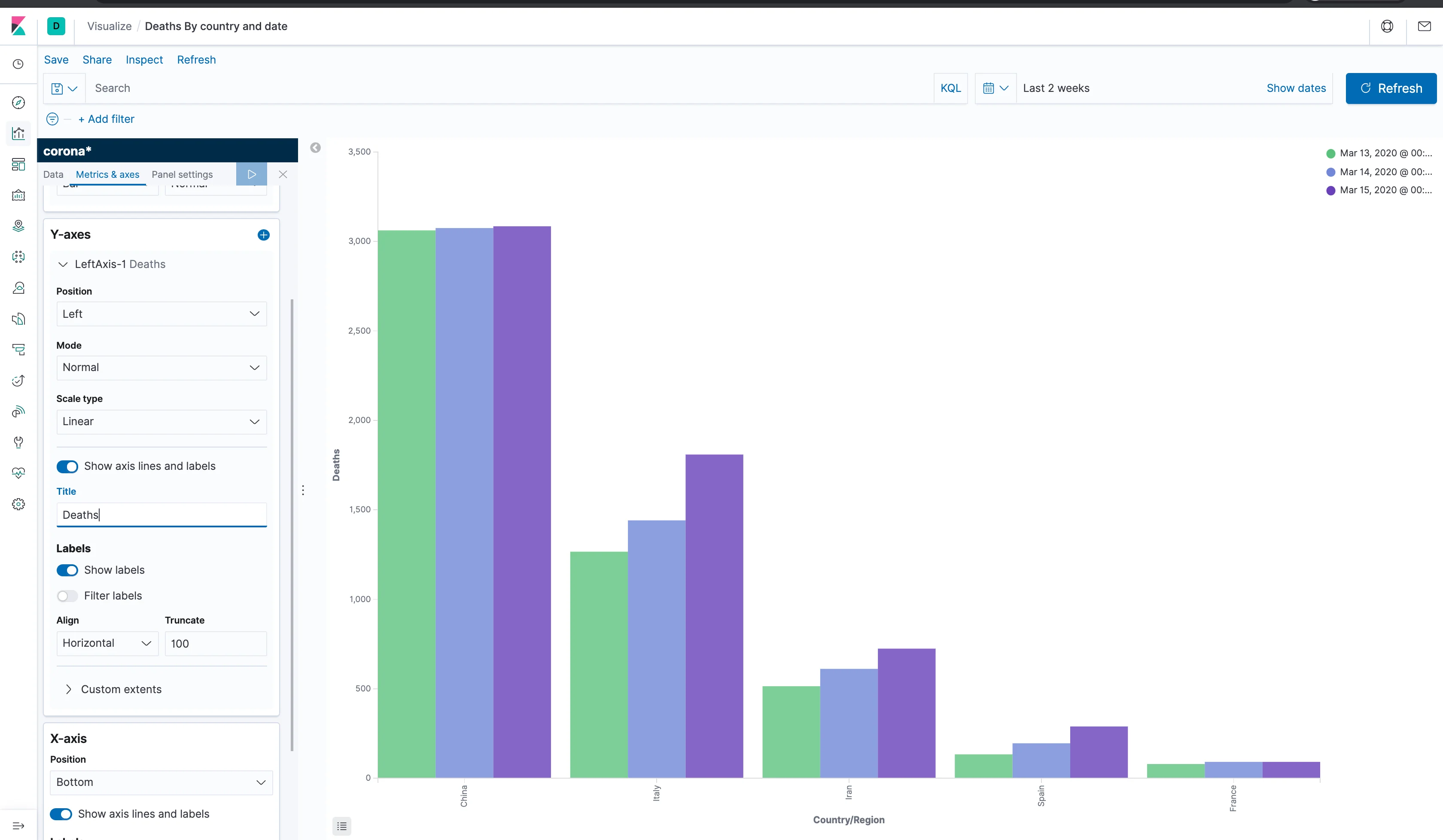
Awesome! We now have a meaningful visualization on the spread of Corona! Now, let's make sure to save our work by clicking Save at the top left part of the screen and give our visualization a name. You can change things up and try and look at different metrics and divide them by different aggregations. Once you're happy with the chart, let's use it to create a dashboard.
Putting your cells together
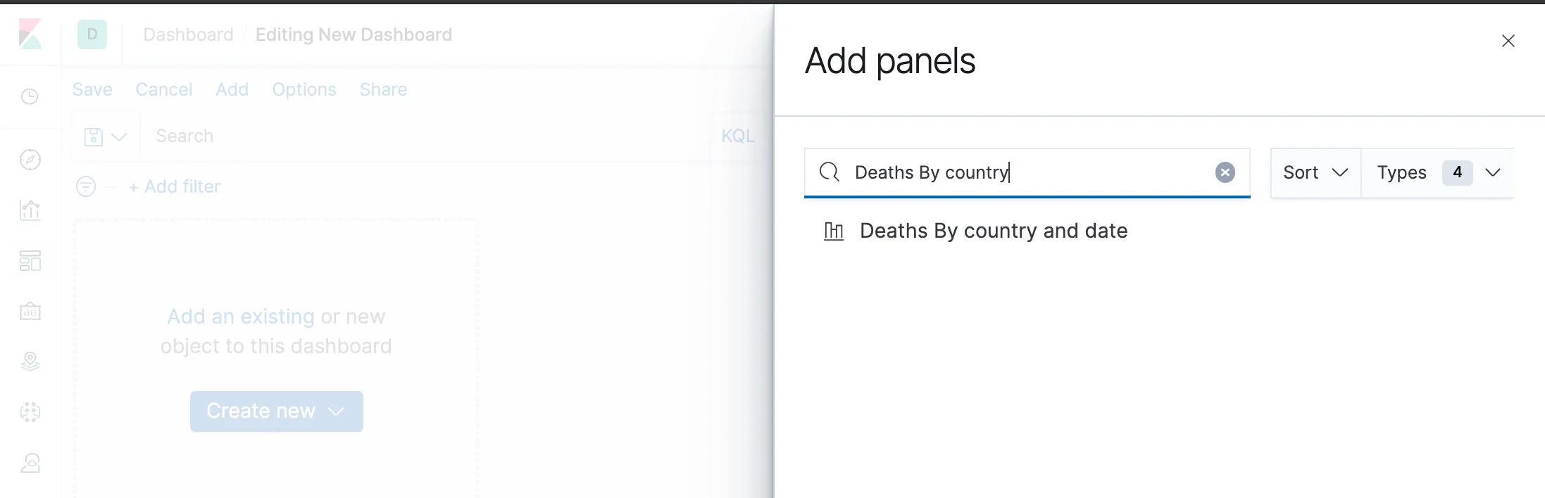
A dashboard is a collection of visualizations and controls that allows the user to interactively explore the data. Let's start by putting the visualization we've just created inside one. Click on the dashboard icon just below the visualization icon and create a new dashboard.
Click on "Add an existing" and choose the visualization you've previously saved. Close the side panel. You can move the chart within the page, as well as resize it and even change or remove its title. Notice that you also still have the time filter and the free text filter which affect the visualization, as well as any other visualizations that we'll shortly add.
In the next post, we'll make the most out of the geographic information in the dataset but, for now, let's have a representation of the totals for all countries. One way to give the user a quick look at totals is the metric visualization, which is basically a single number you can place anywhere in the dashboard. Make sure to save the dashboard, and then click the "Add" button at the top left. Click on "Create New" at the bottom, choose Visualization and create a metric based on the corona* index pattern.
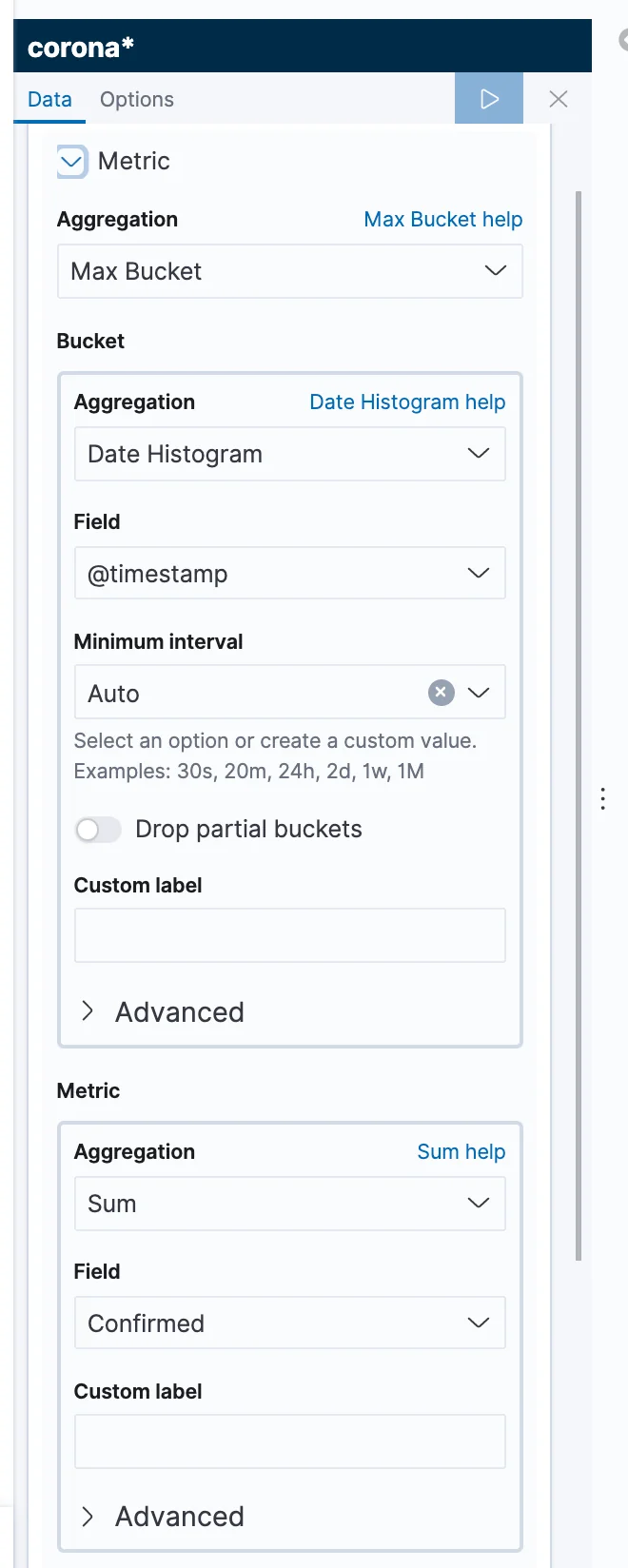
As per the usual, you can immediately see a total count of the documents based on the filter (remember? Documents are the Elastic's equivalent of records). What we actually want, is a total number of confirmed cases from the latest timestamp value. Let's start by changing the metric to the sum of confirmed cases. You should be already comfortable with doing that, after your work on the bar chart. That, however, shows us the sum of cases from all of the dates. To go about getting the latest sum, we need to understand a bit about the way Elasticsearch aggregations work.
In our previous example, we've split the data first by country, then by timestamp, while ordering the inner "buckets", and then choosing the number of deaths for each.
Each of those - the first split, the second split, and the metric - is an "aggregation", so we have several levels of aggregation.
This time, we'll also use several levels, but in a different way. . Our bottom level would be the number of cases. Above it, we'll have an aggregation splitting the data by timestamps. And at the top, we'll have an additional aggregation choosing the bucket with the highest timestamp (in Elasticsearch, this is called a "Pipeline" aggregation).
In order to do that, switch the aggregation to a "Max Bucket" aggregation. Under Bucket, choose a Date Histogram by timestamp and then, in the metric below, choose a sum of confirmed. You might also want to change the text in the bottom to something clearer like "Confirmed". Next, save the visualization and the save button will bring you back to the dashboard.
Once we are back on the dashboard, there really is no need for us to see the title of the metric, as we've already described it inside the visualization. Therefore, let's remove it by clicking on the cogs in the corner of the visualization and choosing not to show the panel title. In addition, we can add similar metrics for deaths and recoveries, making sure to save the dashboard as we progress.
Finally, we now have a dashboard. That's great, but now what do we do with it? If your Kibana instance is available on the internet or in a local network, you can provide a link to the dashboard and send it to whom it may concern. You can also export your dashboard and its visualizations to other Kibana instances by going to the Kibana Management app (the bottom-most application in the menu), choosing Saved Objects and then Export. Rather than having to re-import the data, you might want a more automatic way of loading it, but we'll get to that later in this series.
Next up
Need help setting up Elasticsearch and Kibana for your use case? Reach out to us today!